In the digital landscape of April 2024, UI design continues to evolve with innovative trends that redefine user experiences. From abstract 3D designs to realistic 3D objects, complex gradients, and more, these trends push the boundaries of creativity and functionality. To truly experience the impact of these trends, explore our curated examples featuring animations and interactive elements. Visit the mentioned websites to witness these trends in action, showcasing the cutting-edge future of UI design with elegance, sophistication, and a touch of awe-inspiring uniqueness.
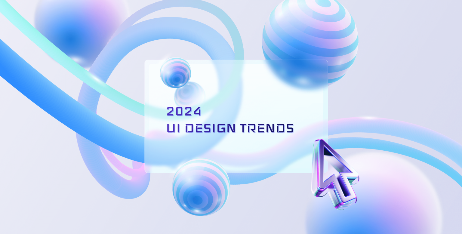
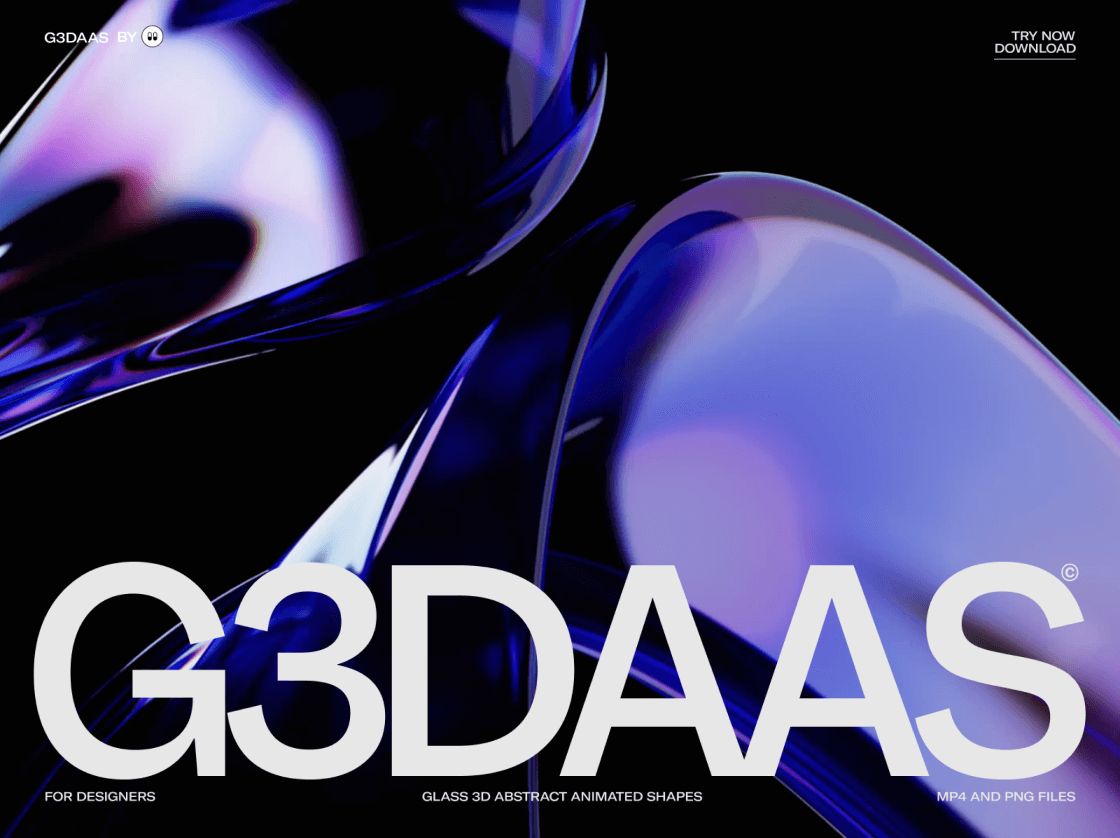
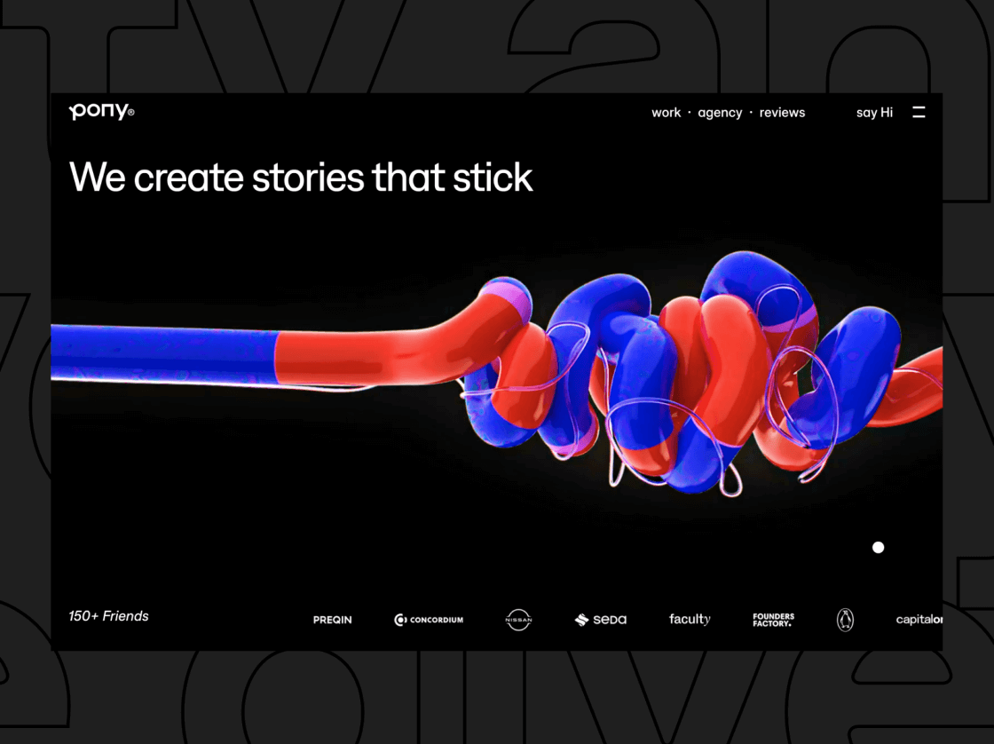
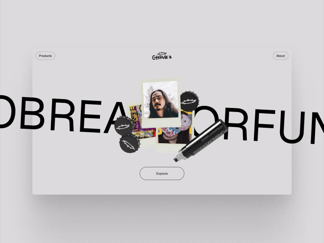
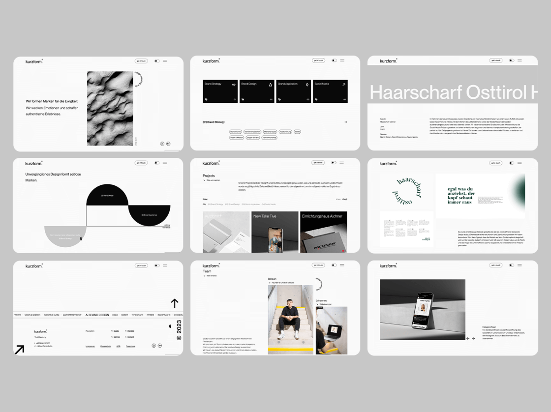
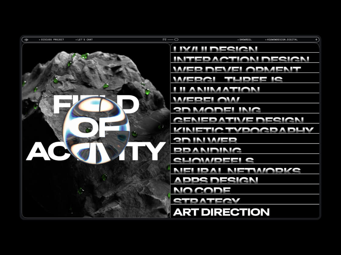
Abstract 3D Design and Material Imitation
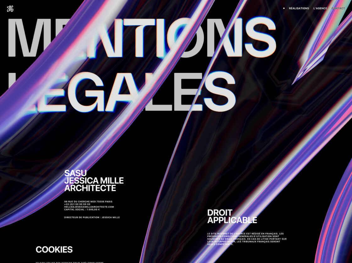
Drawing inspiration from the evolution of digital graphics and the desire for more visually engaging interfaces, abstract 3D design builds upon traditional 3D design by emphasising non-representational shapes and forms. This trend aims to blur the line between digital and physical experiences by adding a layer of realism and tactile sensation to abstract 3D designs.
Innovative abstract 3D shapes shine when used in designs for creative agencies, event management, and art platforms, as it allows them to effectively showcase creativity and innovation and provides a futuristic and artistic appeal. There is a lot of possibility to experiment with a variety of abstract shapes and textures to create visually striking designs with this trend. But one should be mindful not to overcomplicate the design with too many elements that may confuse or overwhelm users.
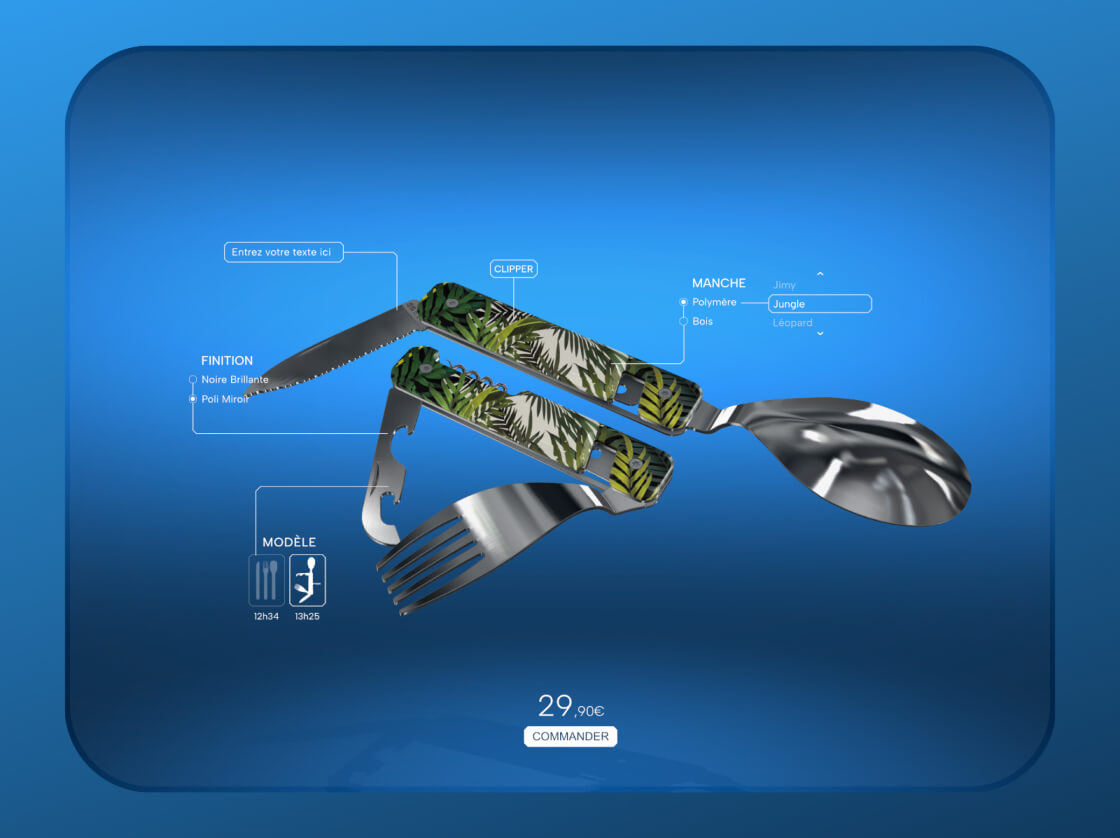
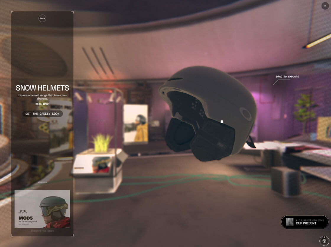
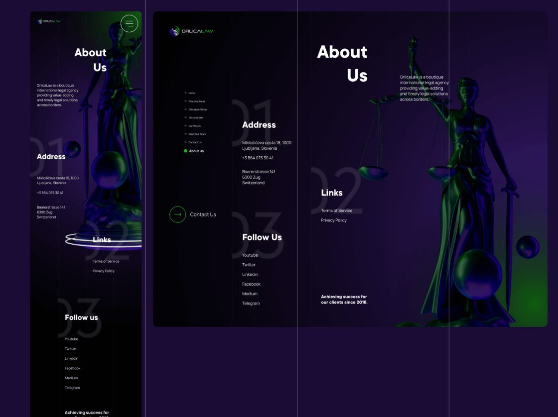
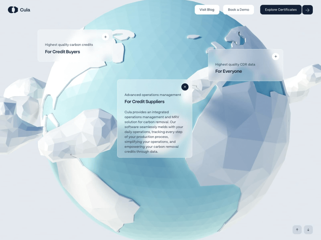
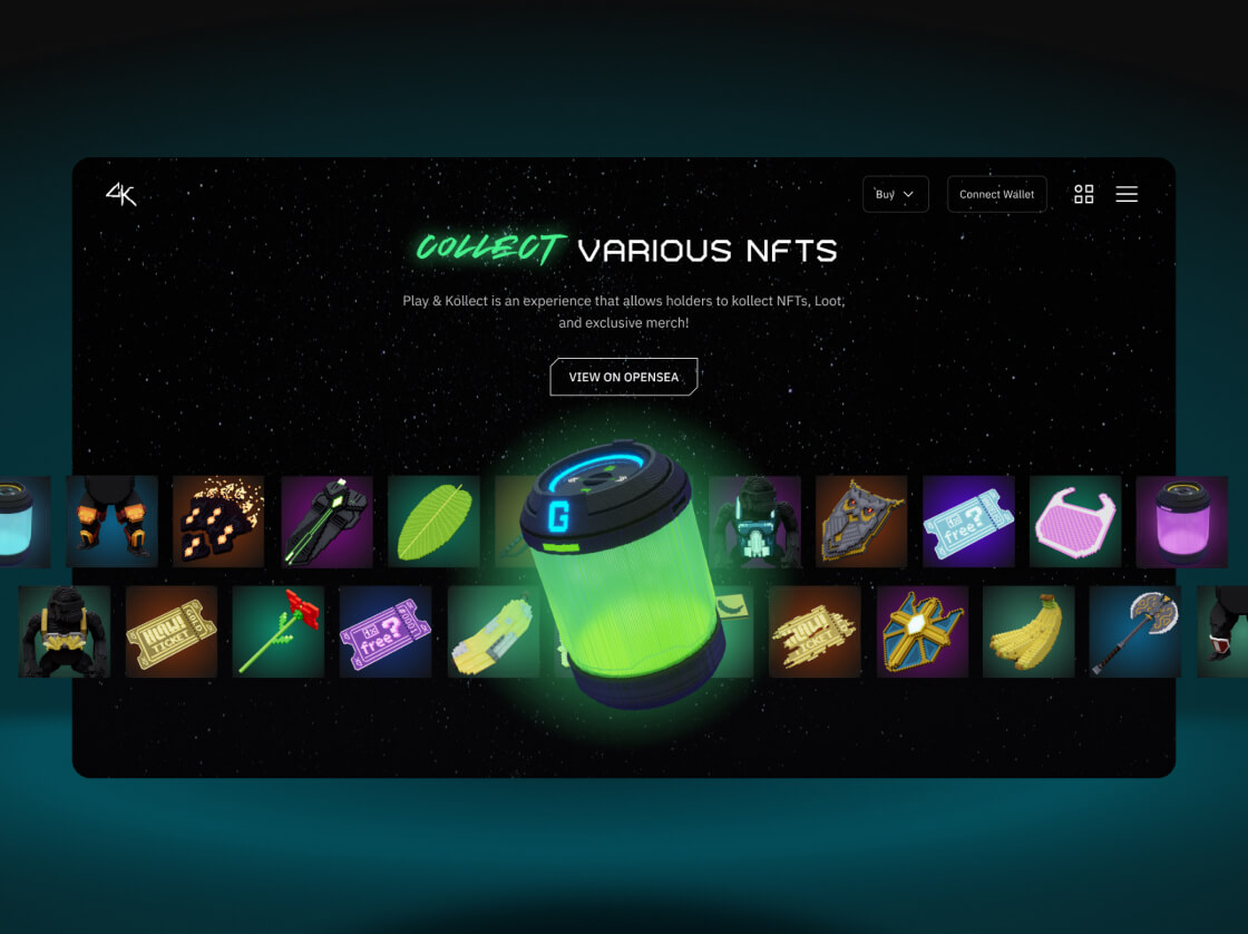
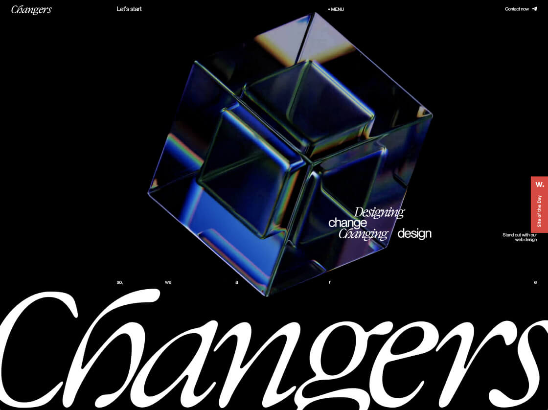
Realistic 3D Objects
Realistic 3D design, emerging from the gaming and entertainment sectors, is pivotal for creating immersive environments. It builds upon previous 3D trends by honing in on lifelike textures and interactions and prioritising detailed rendering and interactive elements. This emphasis enables users to seamlessly engage with products or environments in virtual spaces, bridging the gap between digital representations and real-world objects.
This trend is particularly beneficial for online retail, interior design, and virtual reality applications where product visualisation and user interaction are paramount. However, it’s crucial to prioritise user experience by ensuring smooth interactions and accurate representations. Avoid sacrificing performance with overly complex 3D models that may hinder interface speed.
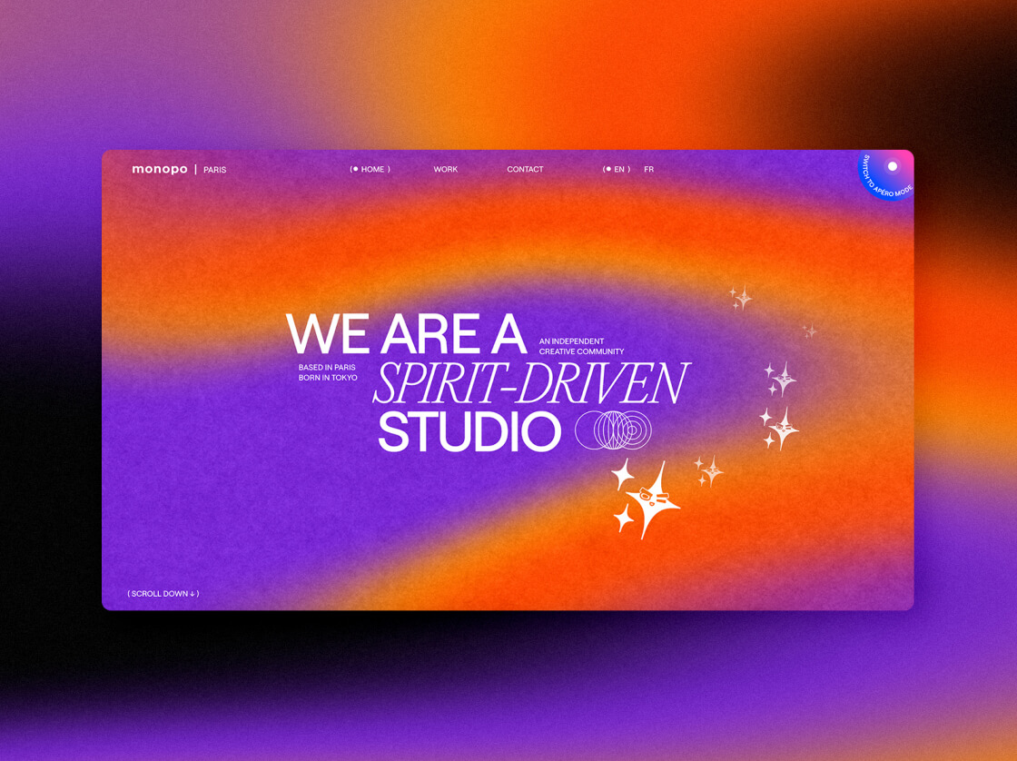
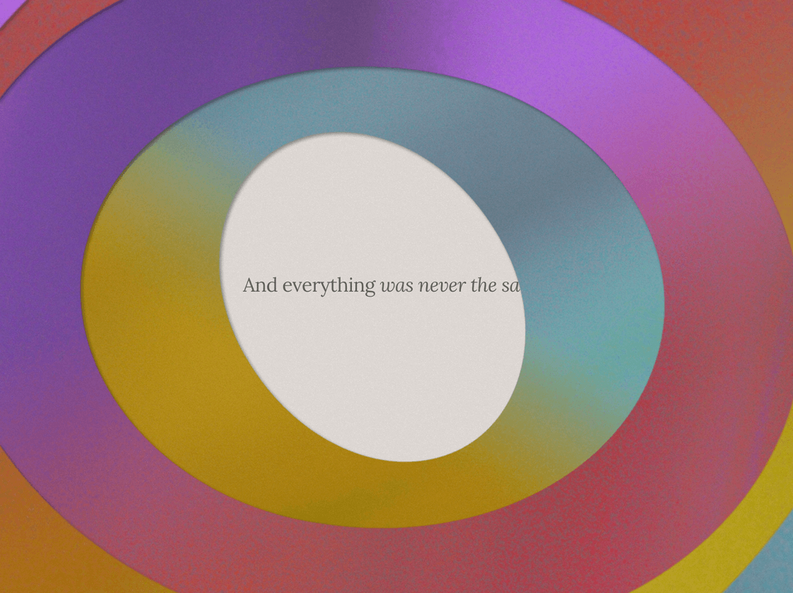
Complex Gradients
Complex gradients take inspiration from past gradient trends but add a new dimension by incorporating interestingly blended colors and intricate transitions. The primary goal of this trend is to create depth and visual interest through sophisticated color combinations. By doing so, it aims to evoke emotions and effectively guide user attention, making it particularly suitable for creative agencies, branding platforms, and multimedia content creators..
To make the most of complex gradients, it’s essential to experiment with unique color schemes and transitions. However, avoid using overly bright or contrasting gradients that may strain the eyes or distract from the content. These guidelines ensure that your designs are memorable and impactful without compromising usability.
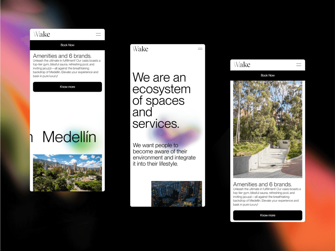
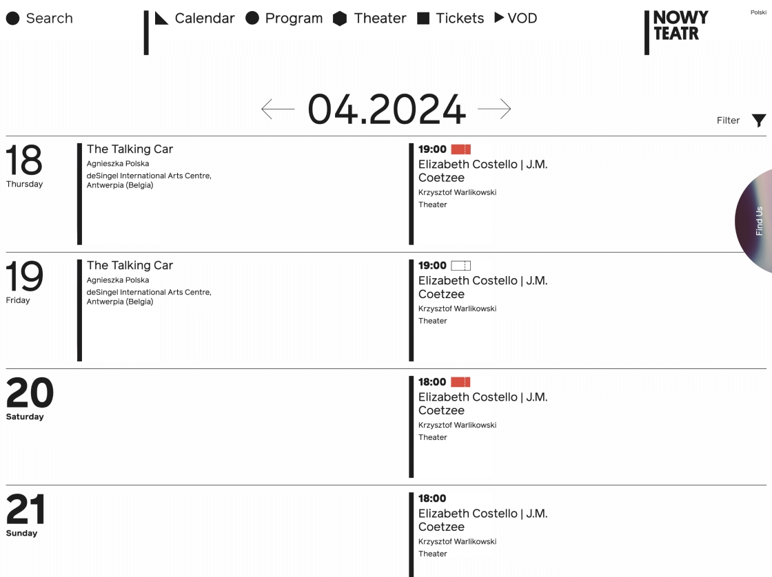
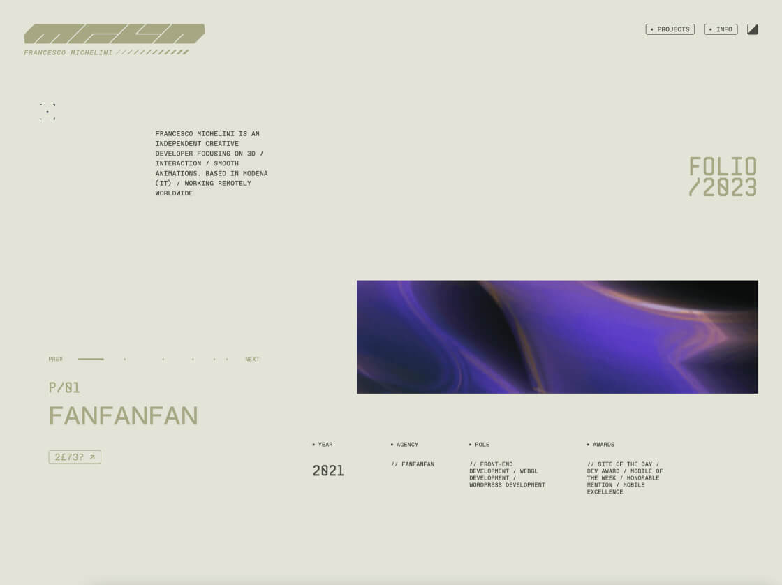
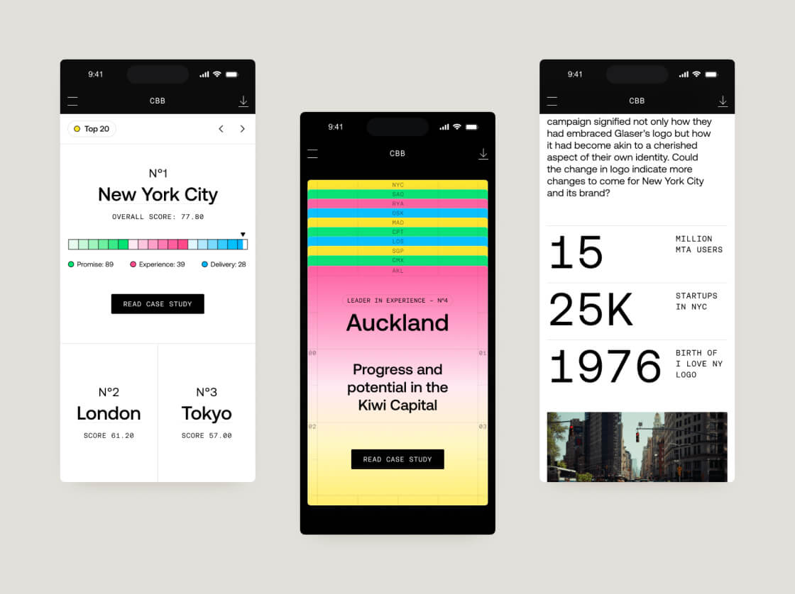
Clean Design in Complex Interfaces
Clean design principles, born from minimalistic aesthetics and user-centric interfaces, represent an evolution in design trends. They prioritize simplicity and usability, aiming to enhance user comprehension and task completion. This trend emphasizes intuitive navigation, clear content hierarchy, and minimal distractions in complex interfaces.
Industries such as financial platforms, analytics dashboards, and data visualization tools benefit significantly from clean design principles. These principles should be applied where information clarity and user efficiency are crucial. It’s crucial to prioritize content organization and maintain a clear visual hierarchy while avoiding overcrowding interfaces with unnecessary elements or complex layouts.
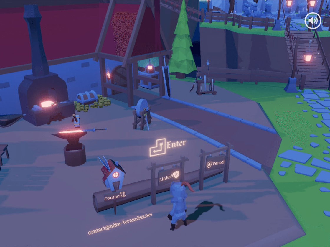
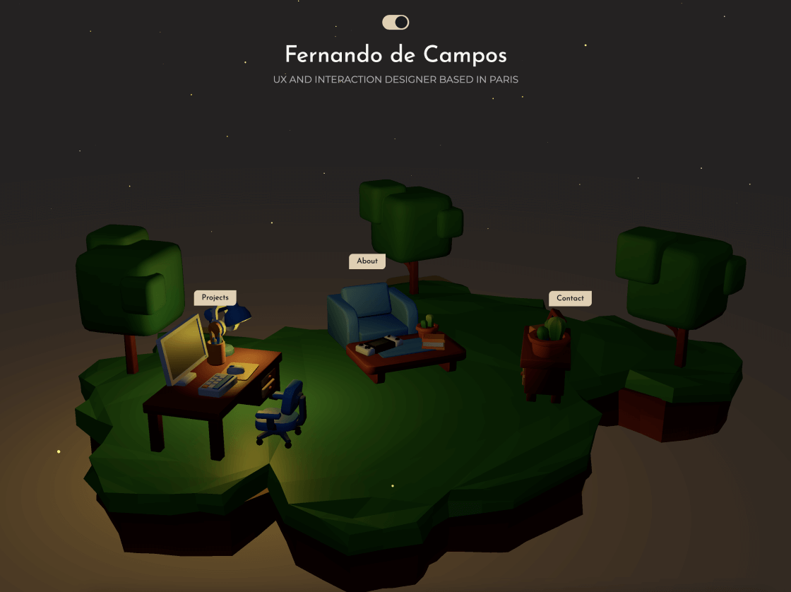
Low Poly Illustrations
Low poly illustrations are born from minimalist art styles and polygonal graphics, a natural evolution from previous 3D illustration trends that emphasized simplifying shapes and forms. This trend is all about using minimalistic geometric shapes to convey complex ideas and narratives with visual clarity and aesthetic appeal in mind.
It finds its place in various industries, including education platforms, storytelling websites, and branding campaigns, where simplicity and creativity are key elements. When creating low poly designs, it’s important to maintain clean lines and balanced compositions. Avoid overly abstract or complex shapes that might sacrifice clarity for the sake of complexity.
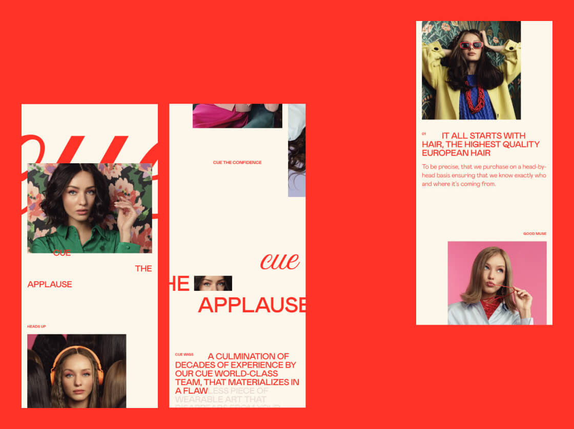
Monochrome Interfaces
Monochrome interfaces are born from the foundations of minimalist design, drawing on visual unity to craft a singular color palette. This trend refines past color approaches, honing in on a single color spectrum to evoke consistency, elegance, and visual harmony. Its goal? To deliver a compelling and unified visual journey.
Industries like fashion platforms, photography portfolios, and editorial websites find immense value in monochrome interfaces, particularly when aiming for heightened visual sophistication and reinforcing brand identity.
To wield this trend effectively, consider experimenting with shades and tones to add depth and contrast. However, avoid overuse, as it can lead to monotony and diminish visual engagement. Strike the right balance to ensure a captivating and harmonious user experience.
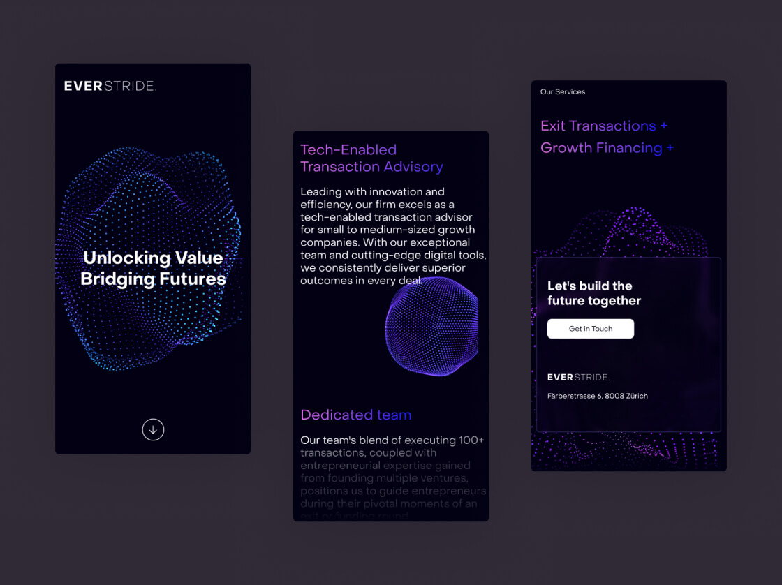
Dark Futuristic Interfaces
Dark futuristic interfaces have evolved from sci-fi influences and premium design experiences, blending elements from previous dark theme trends with futuristic inspirations and sophisticated lighting effects. This trend emphasizes vibrant contrasts and immersive visuals, aiming for a sense of sophistication and innovation.
It finds its place in technology platforms, gaming environments, and luxury brands, adding a premium and futuristic touch to interfaces. Designers should focus on dynamic layouts and interactive elements to enhance user immersion while maintaining usability, avoiding overly complex visual effects that may hinder functionality.
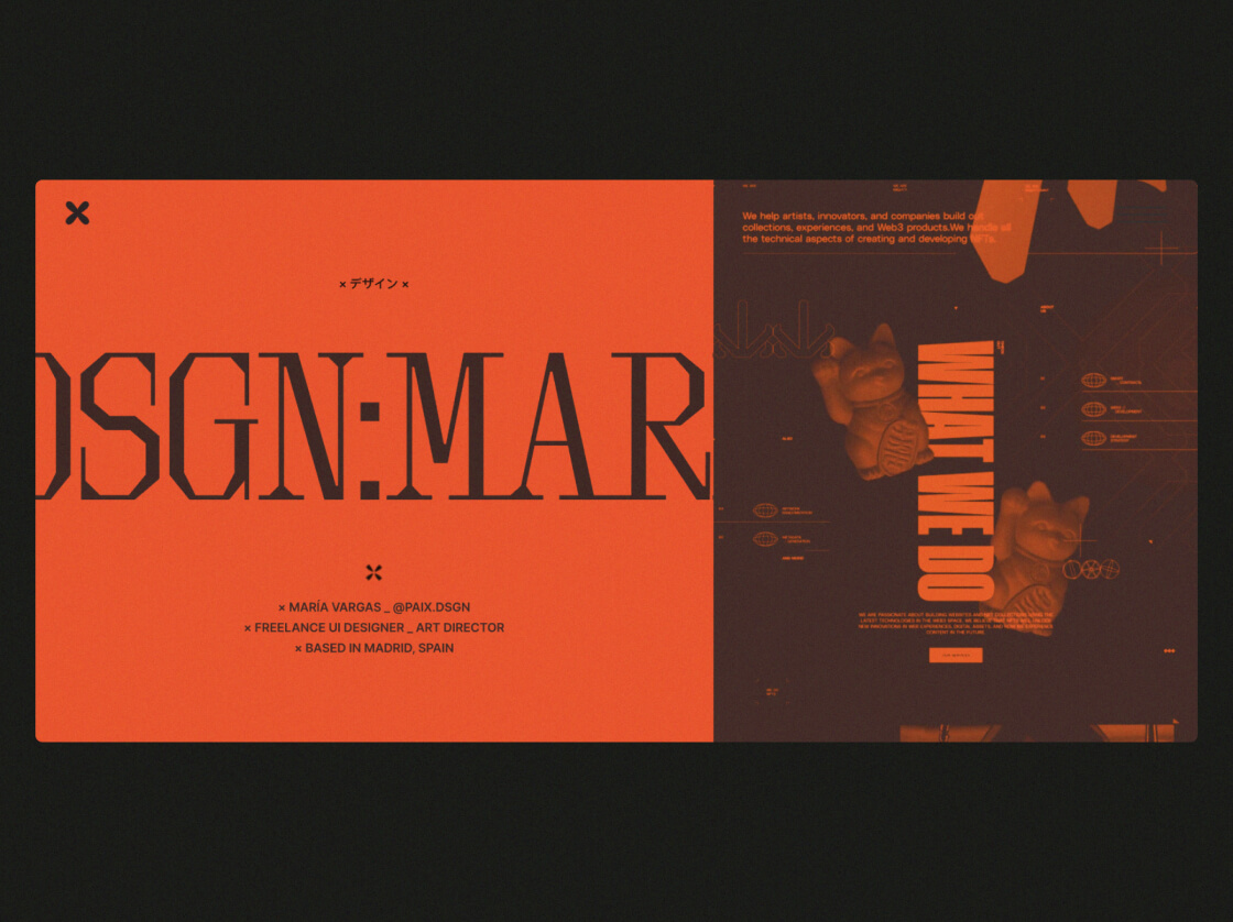
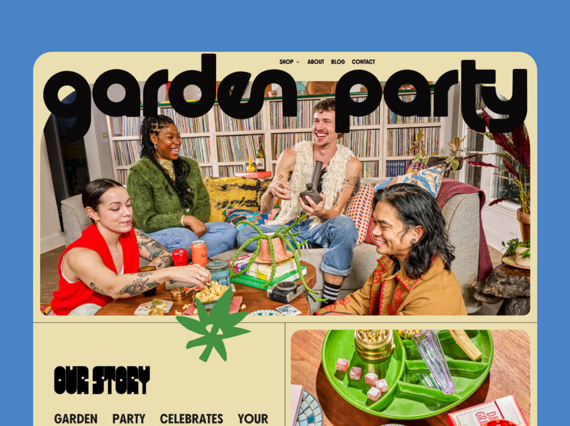
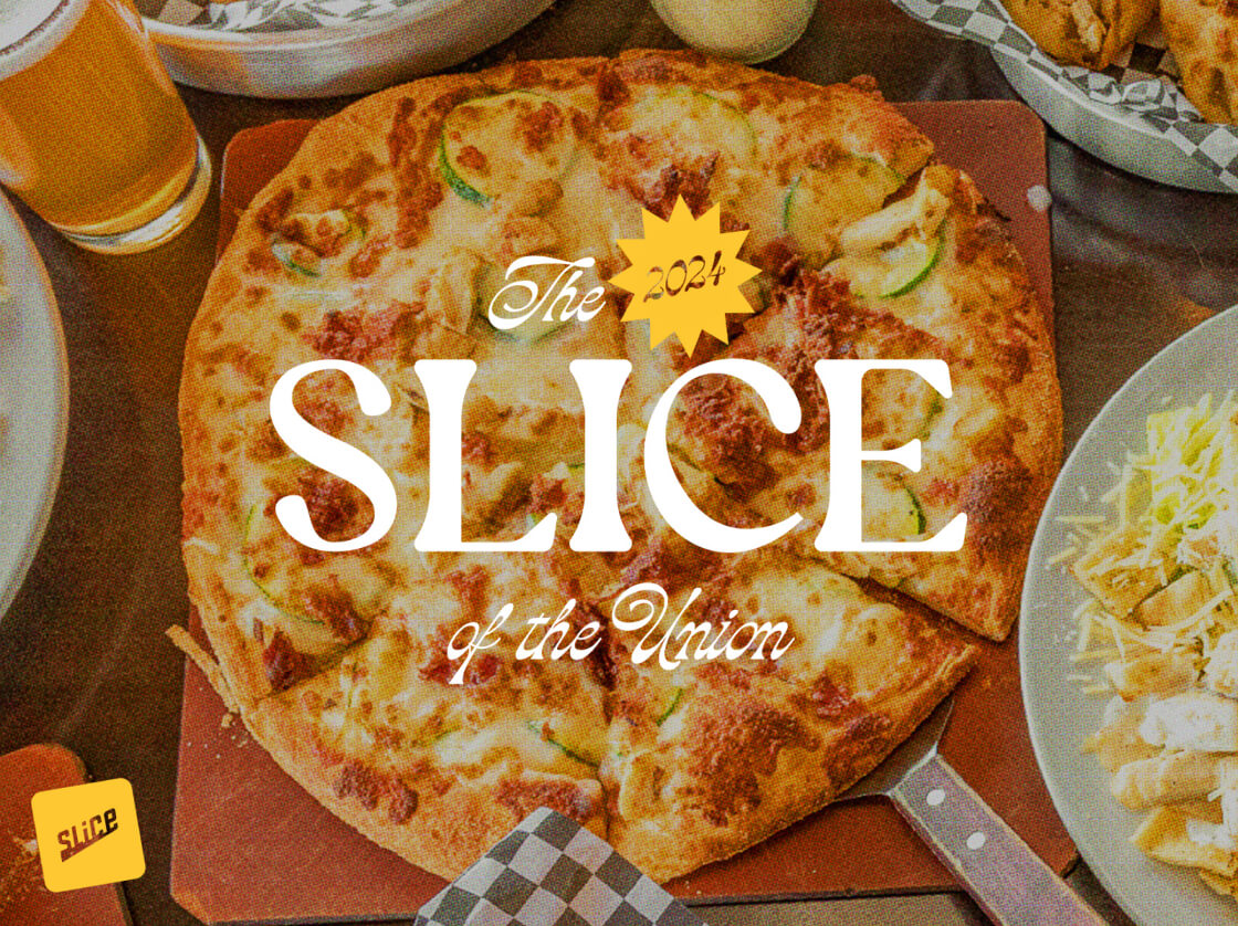
Retro Typography
Retro typography breathes life into vintage design elements and nostalgic aesthetics, building upon past typography trends with its incorporation of retro fonts and styles. This trend is all about invoking nostalgia, personality, and storytelling through its unique visual language.
Primarily embraced by entertainment platforms, nostalgic brands, and themed websites, retro typography finds its sweet spot where emotional connection and brand personality are paramount. It adds a touch of familiarity and warmth that resonates with audiences.
When diving into retro typography, don’t shy away from experimenting with vintage fonts and decorative elements. However, it’s crucial to ensure that readability and clarity are not sacrificed in pursuit of style.
Creative Cursors
Creative cursors are an evolution of interactive design elements, drawing inspiration from user engagement strategies. This trend innovates by integrating animation and customization into cursor designs, enriching the user experience. By focusing on enhancing user interaction and navigation, creative cursors introduce unique shapes and effects to create a playful and engaging interface.
Industries such as gaming platforms, interactive websites, and educational tools greatly benefit from incorporating creative cursors. These dynamic cursors should be applied in interfaces where user engagement and interactivity play pivotal roles.
Effective implementation includes using animated effects and thematic cursors to guide user actions seamlessly. However, designers should be cautious not to employ overly distracting cursors that may confuse or frustrate users, maintaining a balance between innovation and usability.
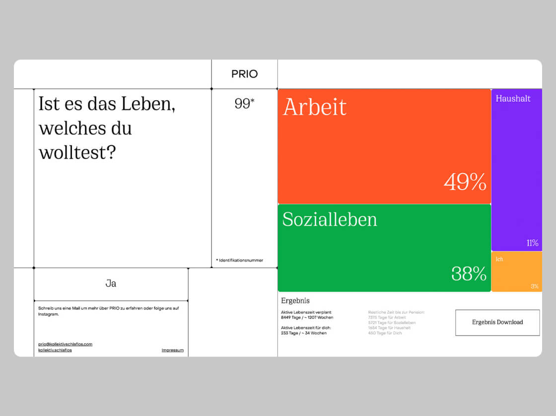
Data Visualization
Data visualization techniques today are more than just about presenting data; they’re about telling compelling stories and making information intuitive. This trend borrows heavily from the principles of information design and visual storytelling, aiming to build upon past trends by placing a strong emphasis on clarity and interactivity.
In practical terms, this means creating engaging and informative data representations through tools like infographics, charts, and interactive elements. These designs aren’t just eye candy; they’re tools that help users explore data more effectively and make informed decisions.
Industries that heavily rely on data, such as analytics platforms, financial services, and research organizations, are the primary beneficiaries of these advanced visualization techniques. These industries often deal with complex datasets that need to be communicated clearly and persuasively, making data visualization an indispensable part of their interfaces.
However, there are some dos and don’ts to keep in mind. Do use intuitive visuals and interactive elements that enhance data understanding. But don’t overload the interface with unnecessary data or overly complex visualizations that may confuse or overwhelm users. Striking the right balance between information and usability is key to successful data visualization in today’s design landscape.
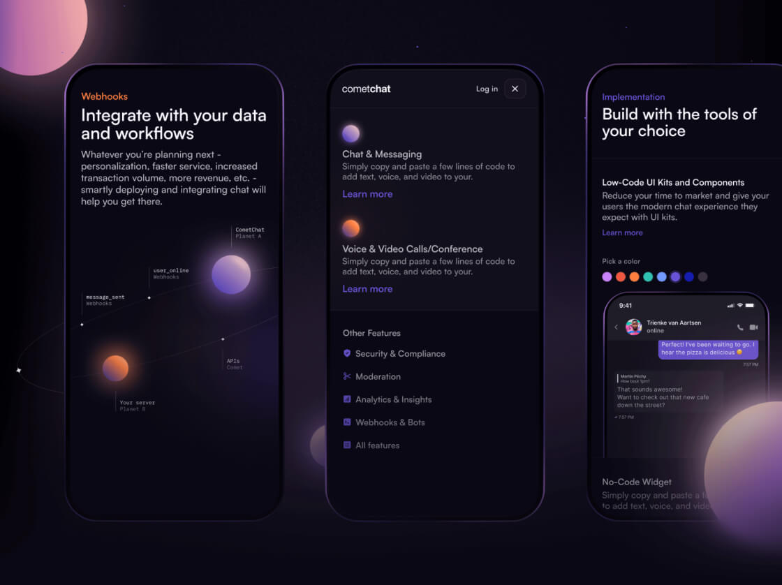
Glass UI Elements
The use of glass elements in UI design are taking the industry by storm, seamlessly blending real-world elegance with virtual functionality. This trend introduces a fresh approach by utilizing translucent layers, subtle reflections, and light effects to replicate the look and feel of glass within digital interfaces. By doing so, designers create a sense of depth, transparency, and sophistication.
These glass-like elements find wide applicability across various platforms, from mobile apps and websites to desktop software and dashboard interfaces. They are particularly favored in lifestyle apps, luxury brand presentations, and creative portfolios where a modern and elegant aesthetic is desired.
To effectively integrate glass-like elements into UI design, designers should adhere to certain guidelines. It’s crucial to maintain clarity and legibility of text and essential elements. Subtle and realistic glass effects should be used to enhance visual appeal without compromising usability. Consistency in design language and leveraging interactivity through subtle animations can further elevate user engagement.
By following these dos and don’ts, designers can craft visually striking and user-friendly digital experiences that embody the sophistication and modernity associated with glass-like elements in UI design.
In conclusion, the world of UI/UX design is a dynamic landscape where trends continuously evolve to meet the demands of modern interfaces. Each trend discussed here, from abstract 3D design to glass UI elements, offers unique opportunities for designers to create visually compelling and user-friendly experiences.
These trends draw inspiration from various sources, whether it’s the evolution of digital graphics, minimalist aesthetics, or nostalgic elements. They bring fresh perspectives and innovative approaches to design, enhancing user interactions and visual storytelling.
It’s important for designers to understand the origins and purposes of these trends, along with industry-specific applications and best practices. Experimentation is key, but it should always be balanced with usability and user experience considerations. By leveraging these trends effectively and avoiding common pitfalls, designers can craft interfaces that captivate users, communicate effectively, and stand out in today’s competitive digital landscape.