 The first thing that a website user sees is the Design. On a beautiful site, you want and can to stay longer. Therefore, we at our company always try to follow trends to provide a quality product for our customers. Our designer pays a lot of time for self-improvement and searching for hot trends, that to choose only the best for you. In this article, we collected the steepest trends, which has long enough to hold on the web design market. As well as gaining popularity trends, which conquered the hearts of designers and users, for a short period of time. We already wrote a similar article, but there we tried to predict trends. What trends we predicted and which didn’t?
- Broken grid layouts
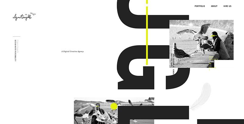
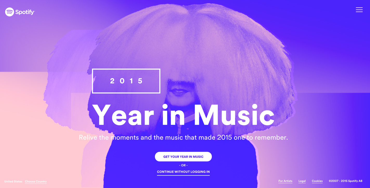
Designers rely on the grid, which has become, in its own way, a limitation. Therefore, the first and, it can be considered a key trend, is the asymmetry of the site. But the construction of the site on the grid, no one canceled. This is a classic, which will always be in the trend, especially for business websites. But it is important to know that in asymmetry the grid is not excluded, because without it the design may simply collapse. The habitual understanding of the grid disappears. Elements can go beyond the blocks, or pass through them, text can cut through the site zones anywhere, and appear in a completely unusual, for the understanding place.
- Animation

This trend began its development in early 2017, but gained great momentum over the past six months. Animation can appear while waiting for the site to load, so as not to be bored waiting. Or as individual elements on the site and accompanying the page scrolling, which brings the livestock and the interest of the site. Smart animation enhances user interaction with the site.
- 3D elements
The existence of a site design in two-dimensional space does not stop graphic designers from introducing 3D elements into the isometry. Incredibly many variations of the introduction of 3D elements in the site. Product overview, logos, individual elements of the site and in general everything you can think of. And the further, the more the 3D trend becomes fashionable.
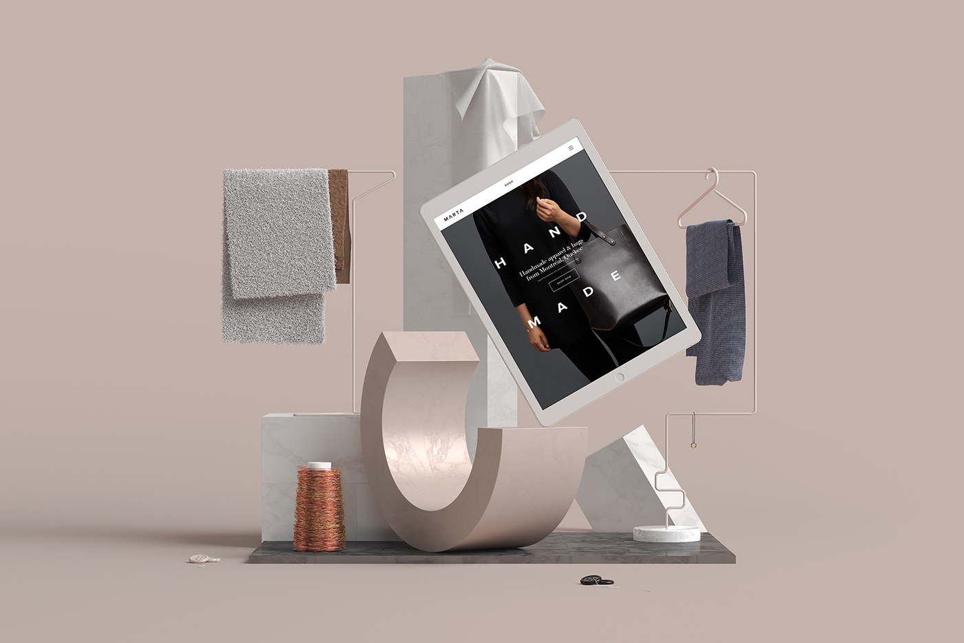
- Illustrations
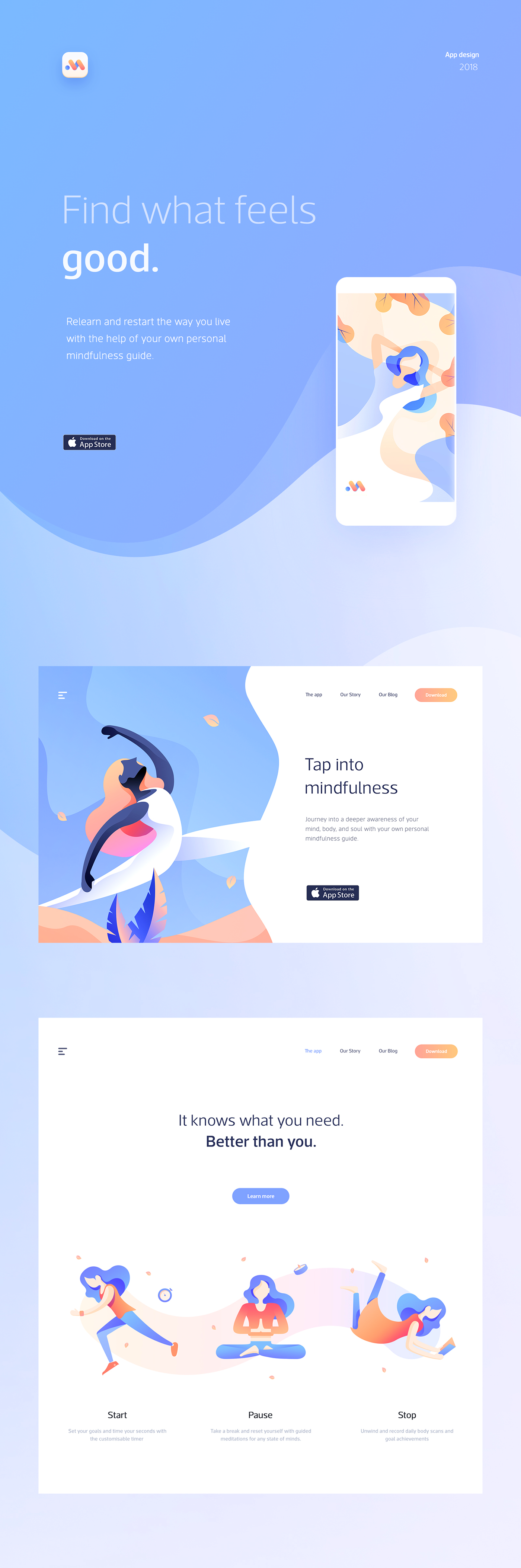
With the problem of designers, how to make your site more unique, the answer was an illustration. At the moment, the illustration has become a trend, because thanks to it, you can easily make a unique site and competently present products. And despite its simplicity and playfulness, a competently made illustration is suitable for serious business sites.
- Organic and oblique shapes

In 2015, all designers began to prefer card interfaces. Due to its simplicity and convenience, in 2017 such interface became a trend, and stayed to this day, but with a slight change. If earlier most of the blocks were pointed, now they have become streamlined and rounded. If you do not consider the card interface, then in the usual site, smooth lines and bends prevail that delight the visitor’s eyes.
- Typography

Previously, fonts were not given such extensive attention. But now the selection of the “right” font for your site has become one of the main trends. The variety of fonts used to be small, But with the increase in variation of different screen sizes, the need for a variety of fonts also increased. At the moment, the trend is large fonts and serif fonts.
- Video content in the interface

Video content has become a trend, because it’s easy and visually beautiful to put in a circle a playing video, which will reflect the whole essence of the product. Especially in our time, when technology allows you to make good quality videos.
- Gradient
Gradients slowly displace the flat colors of the interface. It looks more lively and juicy, and if properly used, you can achieve a beautiful depth of the site. You can ask: why the gradient is now gaining popularity? The answer is simple: there is no such large flow of gradient sites, and it did not bother the eye and the diversity of colors that give uniqueness and depth.
- Interface Animation
Animation of the interface has got into the trends, as this is a great way to direct the visitor’s attention to the right place. A well-designed animation will keep the attention of the visitor of the site and will not let him miss important information. As well as stimulating the interaction with the site.
- Brutalism
 Brutalism is a controversial point on trends. Since the basic law is the rupture of space. The creation of the site is not according to the laws, but at will. When you create on a site that you want, though you do stucco all the trends of the above. Sites in the trend of Brutalism do not lend themselves to the rules of web design and are not created by templates, or with the expectation in favor of external optimization. These are sites that claim “what” and “who” they really are.