To help you find happy users, we have collected the most common mistakes in usability and tips for solving them.
Studies show that investments in UX lead to a reduction in the cost of acquiring users, the cost of technical support, and also guarantee an improvement in the retention of users.
On average, every dollar invested in UX eventually turns into $ 100. This is a stunning 9,900% ROI.
Therefore, it is extremely important to pay attention to the experience of interaction with the user. UX is a set of good design and understanding of users.

In fact, organic growth depends on the quality of the experience of interaction. To help you find happy users, our team has collected the most common mistakes in usability and tips for solving them.
Time to value
If the application is loaded for a long time, then this is very bad!
You can not stand this, and your users too! According to the study, 39% of people will close the website if the images do not load or do it too long.
Time to Value is a term that denotes the time period between a request for certain benefits to a person and before it is performed. In the context of mobile applications, the user must access the application and content in the shortest possible time.

Unlike web users, mobile users do not come to explore your brand. They download the application because it helps them reach a specific goal and perform a specific task.
So go to this task as soon as possible!
Do not require registration without emergency
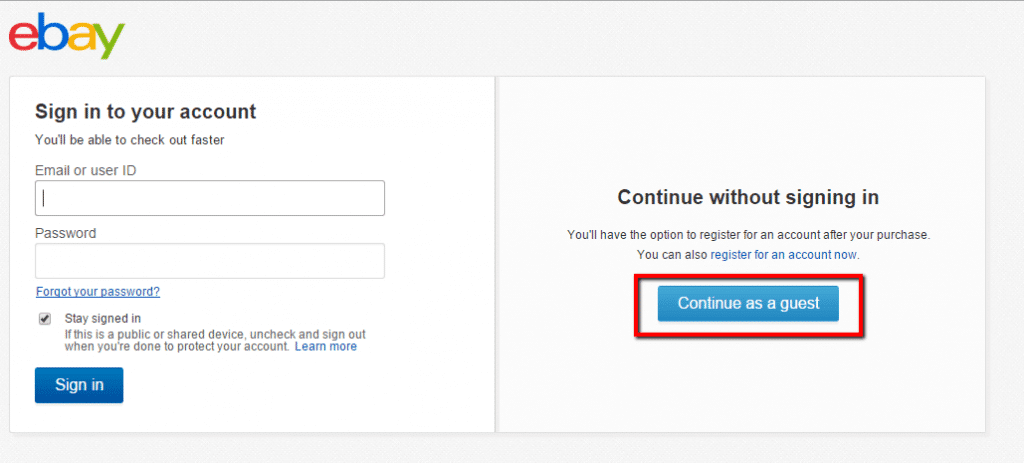
Destroy this wall between you and the user – do not require registration, because not every application really needs it.
We know, you will say that registration will help to personalize the user experience. But do not forget about how many users you lose because of the requirement to register. And they will not return, believe me. According to a study conducted by Localytics, 25% of users abandon the application (and never return) after just one session.

If possible, provide the opportunity to enter the application as a guest, and leave certain functions for registered users only. If they like it, they will definitely register.
Fix errors in user search queries
50% of users use the search function as a navigation tool. Therefore, you need to place a search box on each page of your application. But let’s be honest when was the last time you were looking for something unfamiliar with Google and were 100% sure of the correctness of the writing?

Users make spelling mistakes, but this should not prevent them from getting the correct result. Pull out the options that people are actually looking for. Display closely related words and inform them that their request has been fixed.
Display approximate content for newcomers
New users will probably not have any information in the application. But instead of showing them blank screens, add realism by displaying sample content (even if it’s just Lorem Ipsum).

There are two advantages:
- This is another way for onboarding, you can unobtrusively explain to users how to use the application;
- And also this can improve the retention of users since you lead the user to the next step.
Use the “placeholder” text
As a user, I would not like to not understand what kind of information you require of me.
Therefore, in this case, a “placeholder” of the text in an empty field for entering information is very useful, in order to explain to users what you expect of them.

For example, a phone number can be written in different formats. It can be with brackets around the country code, etc, etc. Use “filler” for such cases to prevent errors.
Good UX is good business. So, provide an excellent user experience for your applications and take the maximum advantage. If you like the article, let us know to give you more useful tips!